It must be summer in Baltimore as the sudden rise in temperature and oppressive humidity not only brings more tourists our way, but also heralds the start of yet another brand/messaging campaign in Charm City, I mean The City that Reads, doh, I mean The Greatest City in America. Yes, another year, another slogan. This one comes courtesy of behemoth brand think-tank Landor Associates and our friends at the Baltimore Area Convention & Visitors Association (BACVA) and the Greater Baltimore Comittee, and judging from the shear size of the new logo alone, I would expect no fewer than 20 people to have participated in the design. You can read some more about the process here and here.
So, being a lifelong resident (albeit my time in school and a brief stint down the road in DC), as well as a designer, critic, and a general acolyte of value added branding, as well as wanting to add some more analytical articles and discussion to the site, who better to analyze this new brand in depth? Let’s begin shall we?

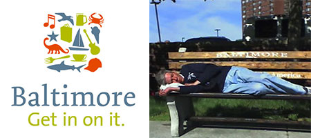
The first thing the new slogan/logo (pictured left), or slogo if you will, must overcome is residual equity of it’s predecessor, “Baltimore, The Greatest City in America” (partially obscured to the right). This slogo has been prominently featured on bus benches in the city for years now. It is a declaration of the city’s superiority (in just what facets we are not directly told) over all other cities. The new slogo is much more colorful, though the warm and fuzzy pallette is lacking a darker more dangerous element, one which really needs to be present to convey the whole story of Baltimore, one of the more dangerous cities in America (we can’t have tourists blithely thinking it’s safe to go everywhere in the city!). But the fact that this logo is not physically confined to the domain of mass transit users and transients makes it the easy winner in this category. Let’s move on.
All of the type is Dutch inspired and designed; the typeface for Baltimore is set in Underware’s Dolly with it’s beaked serifs, the tag in Luc DeGroot’s The Sans, part of the Thesis family, both of which, while beautiful typefaces in their own right, do well to belie the city’s roots as an English colony, and overall lack of connection between the city and anything having to do with the Dutch. But authenticity be damned, we are talking revenue generating tourists!
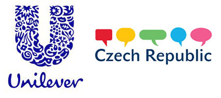
Let’s move on to the mark. This patchwork look has been increasingly trendy as of late. Two recent identity makeovers are sporting the look, one for massive consumer good giant Unilever, the other for massive former Soviet bloc regime Czech Republic. While the baltimore logo attempts recalls Unilever’s whimsy, the agglomeration lacks the overall unifying context of Unilver’s U (and to an extent, the adapatbility of the Czech’s logo) and the icons themselves are also notable for their relevance, or lack thereof. The icons apparently were chosen as part of the process as being evocative of Baltimore, the city. Where to begin…
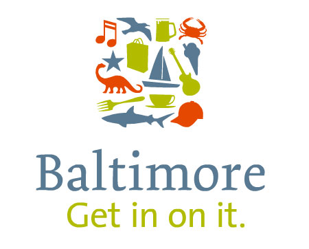
Musical Note: While I am not a huge live music fan, I do know that this is an area in which the city is sorely lacking. There is too large a draw with DC to the South and Philly to the North for Baltimore to catch any major acts, and the underground scene is not comparable to larger, more profitable markets.
Seagull: Yes, being on the water there are many. The tourists love to feed them and the squawk and shit on everything.
Beer Mug: Ahhh, sweet nectar, unfortunately, formerly brewed in the Land of Pleasant Living, our iconic brew now hails from north of the Mason Dixon Line. There is still a lot of beer and places to drink, though no different from any other large city.
Crab: Yes, Baltimore has crabs. Unfortunately most of the Blue Crabs here are now flown in from Louisiana, even Asia, because of over crabbing and pollution to the Chesapeake Bay.
Star: Sure, there are plenty on the older buildings, and here’s a little trivia; the stars were once used by builders to indicate architectural imperfections in the buildings.
Shopping Bag: Of course, come to the Inner Harbor and shop in some of our indigenous local stores such as Sunglass Hut, the Swatch Store, the Body Shop, and Yankee Candle. Bottom line is that shopping downtown is a complete joke, with most of the major retailers having retreated to the suburbs years ago.
Sailboat: Again, we are on the water so there are plenty of boats around, but Annapolis is much more of a sailor’s paradise than Baltimore.
Guitar: Again with the music…
Ice Cream: Very Baltimore.
Dinosaur: There are no fossilized remains I know of, but there is a Dinosaur exhibit at the Maryland Science Center.
Fork: Are we the only city eating food with utensils? Maybe the bus stops are true we really are the Greatest City in America!
Coffee Cup: Maybe the crew at Landor had some vector silhouettes they were dying to use?
Shark: While Sharks are not a native species to the Chesapeake Bay, we do have a kickass Aquarium, and the new Animal Planet Australia: Wild Extremes pavilion is very cool. I’ll allow this one.
Baseball Cap: A representative of the perennial American League East basement dwellers, the Orioles, whose attendance from local fans is laughable. Yes, those magical summer nights in the Yard, where the cheers from the RedSox and Yankee fan over power the 20 or so O’s fans in attendance.
So in summary, the concept, while not a bad one, has been used before, and in this case, poorly executed. Now before you jump to the conclusion that I am a cynic of the city itself, quite the opposite. I believe Baltimore has a lot to offer, more so than a lot of cities I have visited, its just that most of the interesting sights and sounds are not confined to the Inner Harbor. But as far as the slogo goes, one not acclimated with the city would have little reason to venture outside the tourist trap of the Hard Rock Cafe and ESPNZone, which is a shame.
The slogo really puts the emphasis on activities and imagery which are arbitrary and not uniquely Baltimore. It emphasizes touristy attractions and activities lacking any type of cultural context, and that runs contrary to the very notion around which the campaign was hatched; the appeal of a city unspoiled by a massive tourism based economy, a city that has a secret to share, that those in the know are part of and that others who aren’t need to “Get In On It.”
This re-brand is a massive failing by all parties involved, as well as a wasted opportunity to unite the city. The greatest salesmen of any brand are it’s supporters and zealots (i.e. the citizens of the city who liked it so much they have decided to live here), and this slogo thing fails to unite or even impassion a city that has a lot ot offer in the way of hospitality, attractions, and events. Also, I have to point the finger for not hiring a local firm for the job. The lack of context in the iconography and logo is clearly evident of this. Perhaps next summer will bring a better slogo. Go O’s!